-
 contact@diggers-consulting.com
  01 73 28 29 65
 LinkedIn


The use case
I have been a F1 fan for years now. Like in any other sport, there exist passionate and endless debates about who is the best driver in history. A question impossible to answer, given the number of parameters that could be taken into account.
A simple parameter to start with is the number of points scored by drivers each year: it’s a simple and factual way to compare drivers over years. But the issue is that scoring systems have evolved over time, creating distortions between championships.
Example: in the nineties, only the top-6 drivers of each race scored points (10,6,4,3,2,1). Today, the top-10 scores points with a significant higher number of points available (25,18,15,12,10,8,6,4,2,1).
The idea of this first tutorial with Atoti is to create different scenarios based on different F1 scoring systems and run simulations to see the impact of the world championship results: with a different scoring system, would Felipe Massa have become world champion against Lewis Hamilton back in the 2008 (he actually lost the title at the very last race of the championship, in Brazil, in a dramatic scenario)? Or would Michael Schumacher have become a 7-times world champion with a constant scoring systems over his career?
Ok, let’s analyze the data!
Jupyter notebook
You can download the Jupyter notebook F1 data analysis with Atoti from my github, simply follow the link!
1. Initialization & creation of the Atoti session
Creating an Atoti session only requires few lines of code:
2. Data stores
We need to import the data into stores, all the F1 data is available on Kaggle, from 1950 to 2019 (here). We will import here the data related to drivers, races and race results.
Once the stores are created and the data loaded from the csv files, we can link the data stores.
Finally, run the load_all_data() command to load all the lines into memory (see this article on Atoti for more details on the automatic data sampling feature).
3. Cube
We will create only one cube in this tutorial, to generates aggregates (measures) on race results data, on different dimensions (levels).
4. First data visualizations
Ok, the basic setup is done, let’s run a first data visualization in order to check if everything is ok.
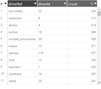
The result is the following table (the parameters of this view are saved inside the notebook):
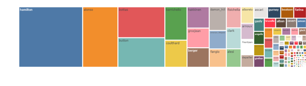
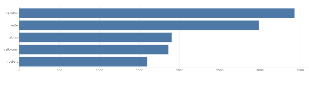
You can also choose between different type of charts, for example below a tree map representation of the total amount of points in career by driver:
5. First queries
In this first tutorial, we will focus on the points.SUM measure created by default in the cube.
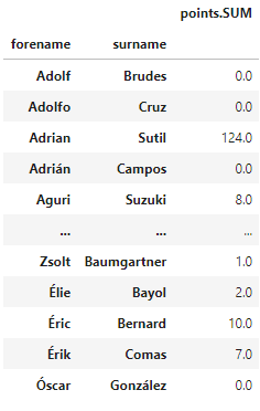
We can run some queries, a query returns a pandas Dataframe.
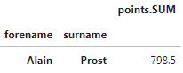
A query can be filtered using the condition parameter.
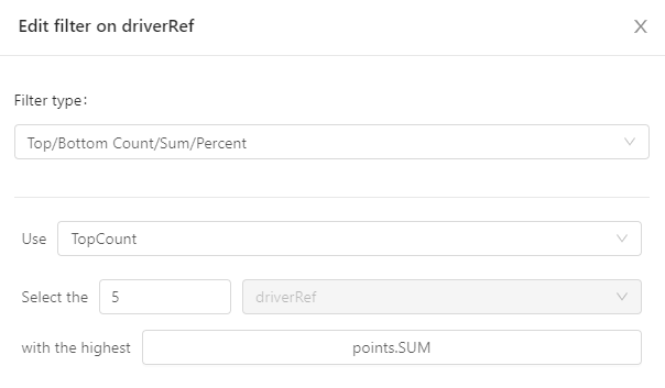
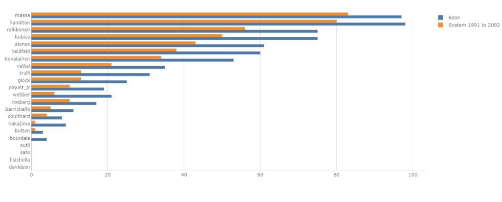
You can also build charts with advanced filters, such as the ‘TopCount’, which is configured directly in the widget.
6. Measures
We now need to create specific measures to determine, for example, the world champion name for a given year, based on the total of points scored in all races of the season.
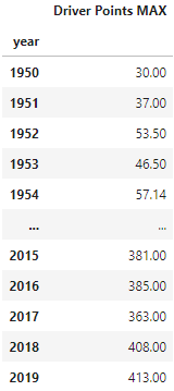
Step 1: we define a measure to calculate the maximum number of points scored by a driver:
You can run this aggregation per year, but you can also use it on any other dimension! For example, to determine the driver who scores the more points on a given venue, like this:
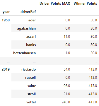
Step 2: we define a mesure that will return the max value between different drivers on a level:
To illustrate the difference between these 2 measures, let’s run the following query:
Step 3: we finally create a new measure ‘Winner’ that will only return the first driver among N where the sum of ‘points.SUM’ equals ‘Winner Points’ result
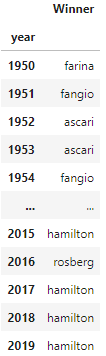
As a result, we can now query the list of world champions (with the simplified model as mentionned at the beginning, meaning that the results are only correct for years between 1991 and 2018 exlucing 2014):
7. Let’s setup our simulation
At this stage we can create a simulation, with different scenarios corresponding to the different scoring systems we want to test.
We will load in the simulation the scenarios with the following scoring systems:
- sc1991to2002_scenario will be loaded with the scoring systems in effect between 1991 and 2002: [10,6,4,3,2,1]
- sc2003to2009_scenario will be loaded with the scoring systems in effect between 2003 and 2009: [10,8,6,5,4,3,2,1]
- sc2015to2018_scenario will be loaded with the scoring systems in effect between 2015 and 2018: [25,18,15,12,10,8,6,4,2,1]
See notebook for details.
8. Amazing results!
We’re done! We can now visualize the impact of the different scenarios on the World Championship results, comparing the name of the WC per year.
In this table, we highlighted the changes in red (by adding some conditional formatting to the MDX code in the widget):
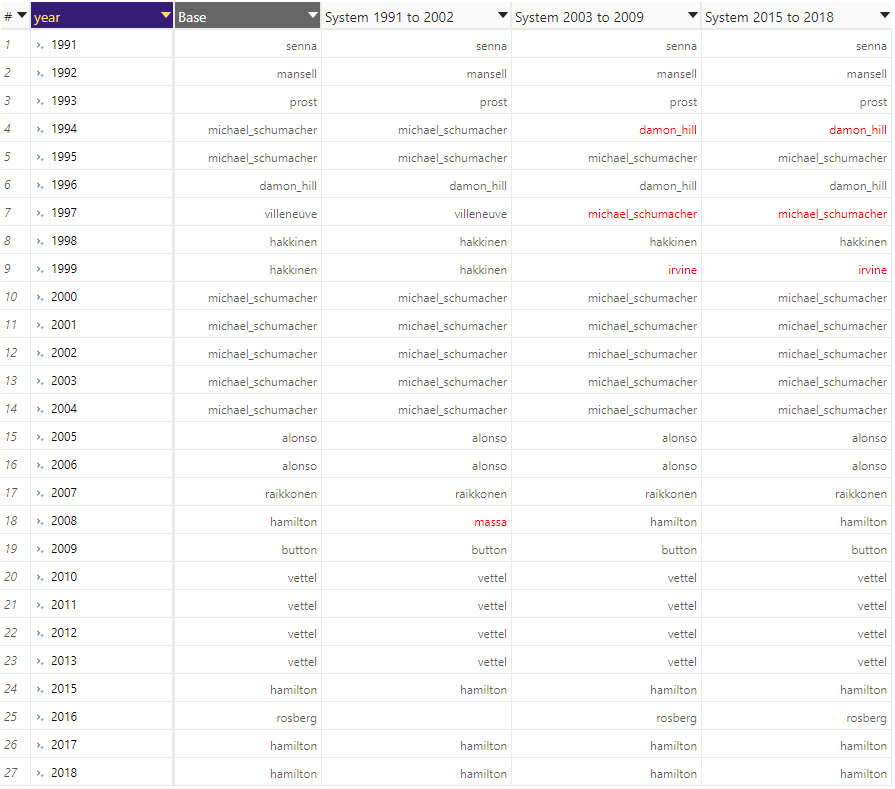
The results?
Interesting to see that using 2003-2009 and 2005-2018 scoring systems we would have the same impacts:
- Damon Hill would have become a 2 times WC, while Michael Schumacher would continue with 7 titles, but Villeneuve would have lost his crown in 1997… And Eddy Irvine would have won the title in 1999 againt Mike Hakkinen (the year Michael Schumacher broke his leg and missed several races)!
- We can notice the limitation of our measure « Winner »: in 2016, with the 1991-2002 scoring system, the value is empty. We have an ex-aequo between Rosberg and Hamilton! Actually, Hamilton would have won the title instead of Rosberg, because he won 10 races against 9 for Rosberg!
And what about the famous and dramatic race in Brazil 2008?? Would Felipe Massa have become world champ in 2008 with the 1991-2002 scoring system? YES!
For those of who who are now curious, you can watch the race summary here 😉
I hope you enjoyed this lecture. It’s a basic tutorial on how to use Atoti, we will continue with more advanced examples in the future.
About us
Diggers is a consulting firm, expert in business, technological & cultural transformations, created in 2018 and built on sustainable principles: people and personal development are the very core of our model. Our inner conviction is that creating value for our consultants will create value for our clients, our partners, the company itself, and our whole ecosystem.
We are an ActiveViam partner since 2019, helping our clients to define their IT architecture around the classic Java version of ActivePivot, develop performant applications for data analytics and reporting in ActiveUI or in customized front-end applications. We are now ready to provide our expertise to our clients on Atoti, the Python API for ActivePivot, making available the power of ActivePivot to Business Users (such as Data Scientists, Data Analysts) directly into their JupyterLab environment!
For more information, contact us at contact@diggers-consulting.com
Credits: cover photo by Jeff Cooper on Unsplash